Write on, Brother!
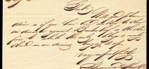
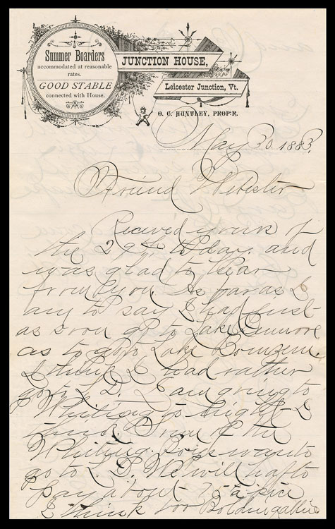
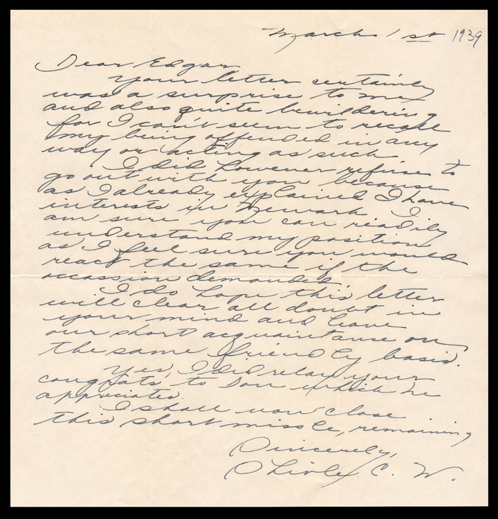
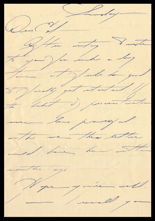
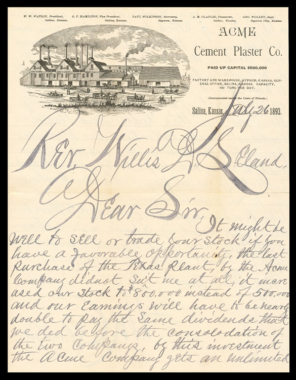
One aspect of collecting manuscript material and/or postal history is the challenge of deciphering vintage handwriting. But there is also the occasional joy of coming across handwriting that is eye-catching . . . sometimes because of its elegance, sometimes because of it’s unusual and quirky nature, sometimes because it is nearly inscrutable.
Here are some examples.
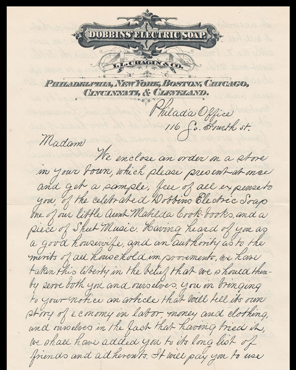
Dobbins’ElectricSoap150This one reminds me of the Palmer Method handwriting (though Palmer is more precise than this example) which those of us of a certain age all learned and practiced in grade school. (And no can no longer do because the skill has atrophied from disuse.) “The Palmer Method of penmanship instruction was developed and promoted by Austin Palmer in the late 19th and early 20th centuries. It was largely created as a simplified style of the “Spencerian Method”, which had been the major standardized system of handwriting since the 1840s. The Palmer Method soon became the most popular handwriting system in the United States.” (Wikipedia)
Somewhere around here, I have some Palmer Method practice books, which I’ll find and add to this post sometime soon.
The Dobbins’ Electric Soap promotional letter is printed by lithography from a handwritten original.
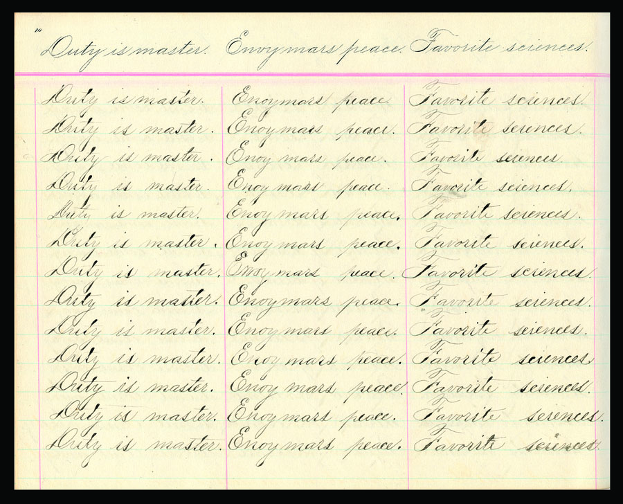
Went looking, first came upon a writing practice book for a different system than Palmer’s, the Duntonian (1873 edition of a writing book first issued in 1870) . . .
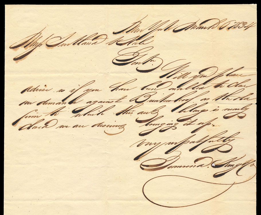
Difficult to read, but wonderful to look at.
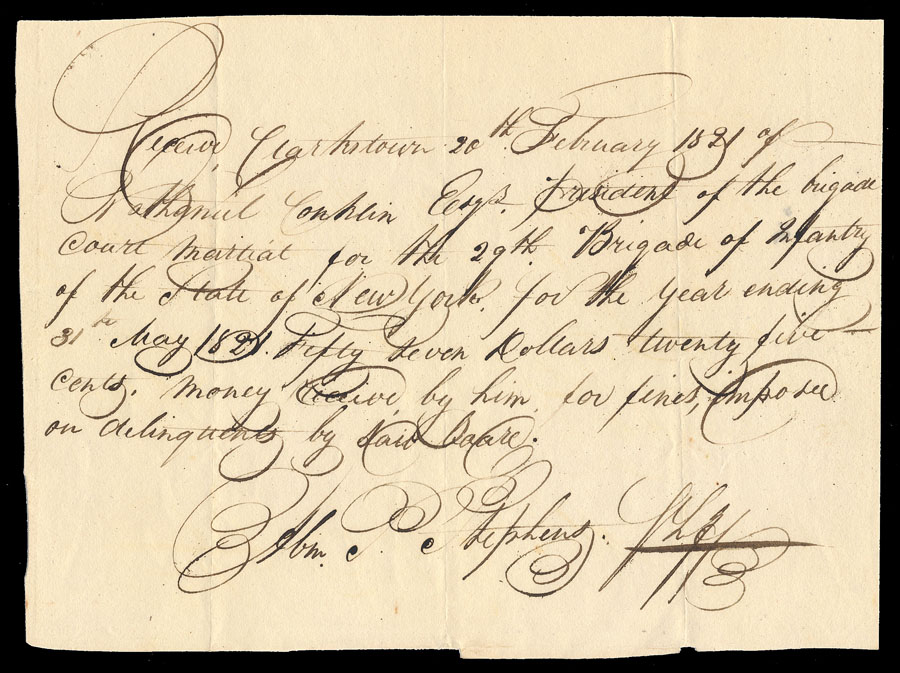
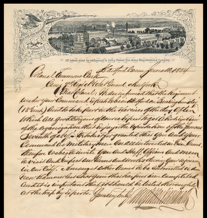
I once knew whose wonderfully unreadable signature this is, but do not now remember and cannot decipher . . . anybody out there who can help?
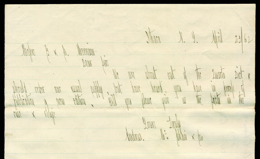
Left-handed, and quirky all around.
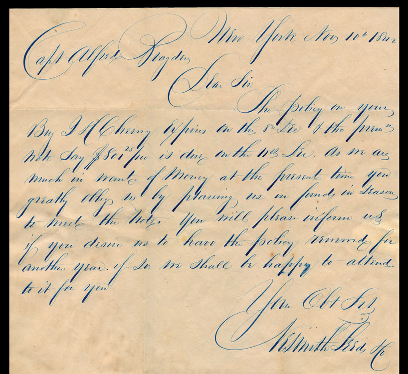
Tres elegante.
Swash, swash, swash.
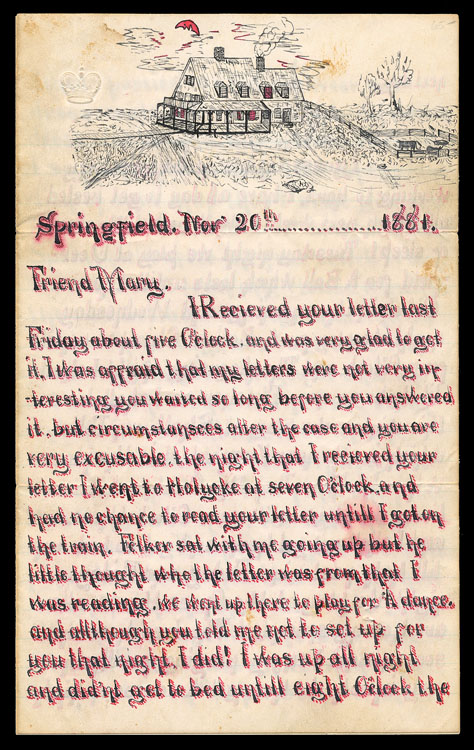
This is a several-page letter, whose writer (letterer, really) put in an enormous amount of meticulous handwork. The things we do in the name of love.
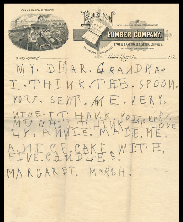
The early attempts of kids are often engaging.
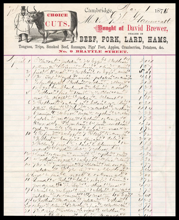
The individual purchases listed are pretty hard to make out, but overall it creates an unintended, sort of pleasing texture/pattern.
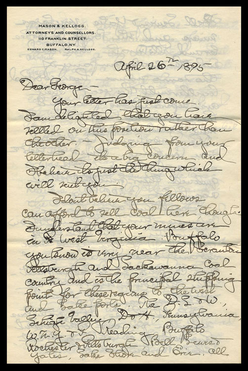
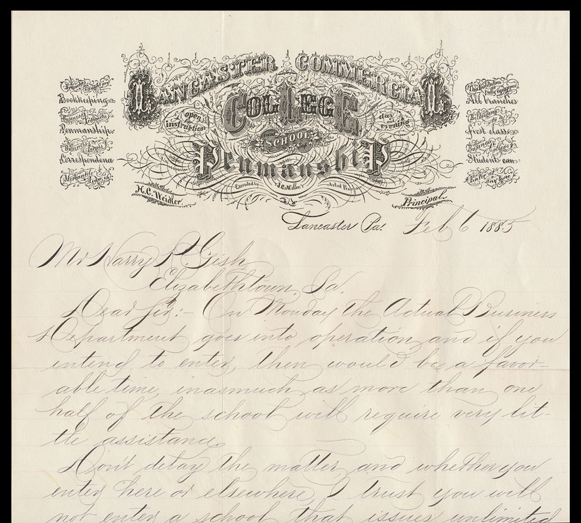
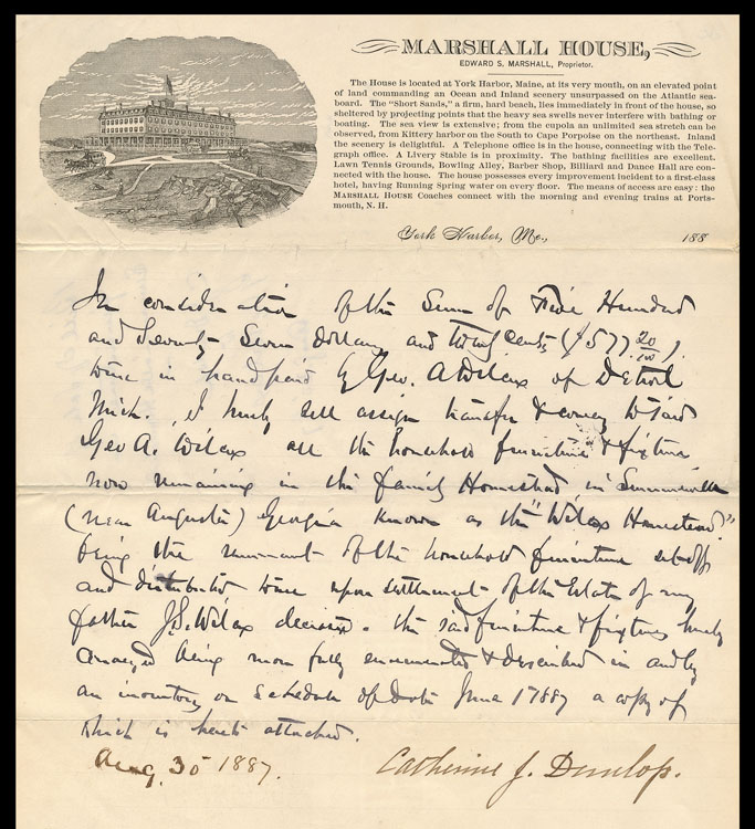
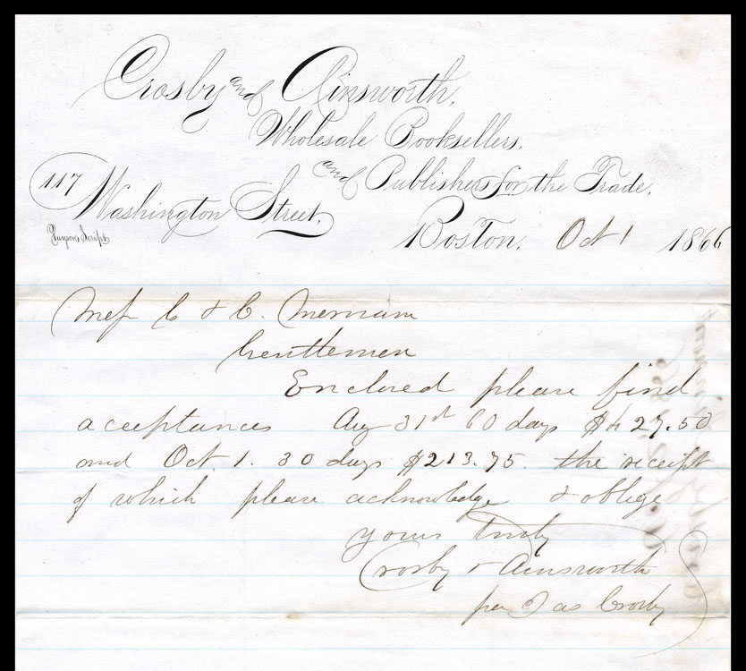
In the lower-left, this letterhead’s printed text is credited to “Payson’s Script”. I do not exactly what is going on here: perhaps Payson personally rendered it on a litho stone?
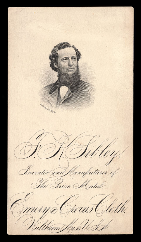
A similar example, printed by lithography.
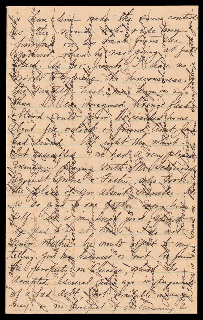
Cross-writing, sometimes in a contrasting color, was commonly used when a writer ran out of available space but wished to say more. This particular 1883 letter has interesting content, including a description of a visit to a circus, where Jumbo was on display (passage above): As for Jumbo, I have no words to express the hideousness of the mighty beast, more huge in size than I ever imagined living flesh and blood could grow.
1883 was the year of completion of the Brooklyn bridge. Barnum offered to have Jumbo walk across to demonstrate the bridge’s strength, but his offer was declined.
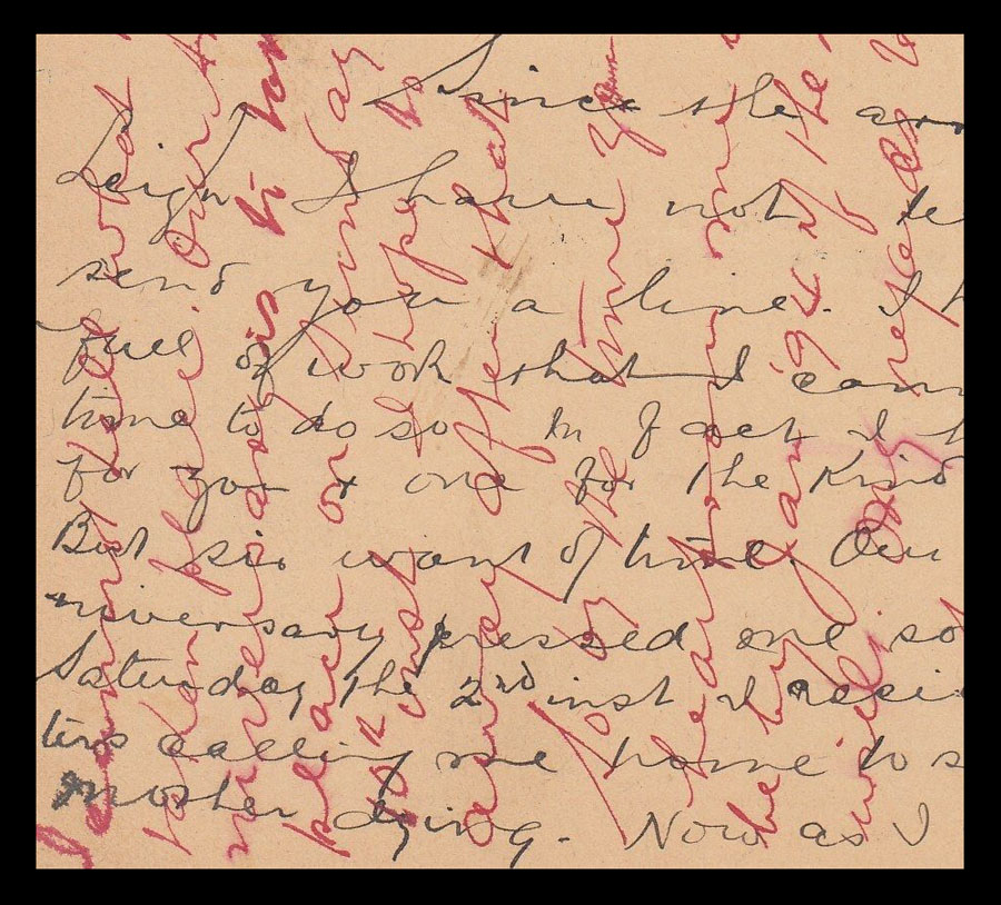
Cross writing in two colors of ink.
